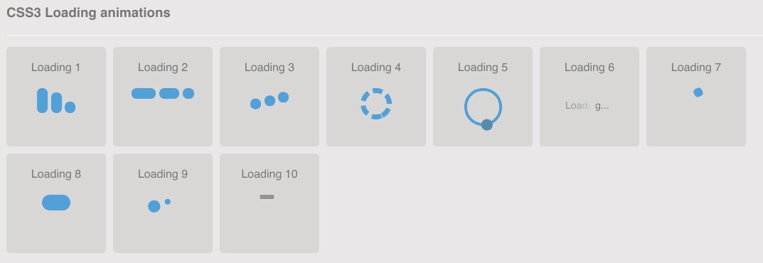
Giới thiệu với các bạn 10 kiểu loading cực đẹp chỉ bằng css animation
HTML
Dựng khung HTML:
<body> <div class="content"> <h3>CSS3 Loading animations</h3> <div class="load-wrapp"> <div class="load-1"> <p>Loading 1</p> <div class="line"></div> <div class="line"></div> <div class="line"></div> </div> </div> <div class="load-wrapp"> <div class="load-2"> <p>Loading 2</p> <div class="line"></div> <div class="line"></div> <div class="line"></div> </div> </div> <div class="load-wrapp"> <div class="load-3"> <p>Loading 3</p> <div class="line"></div> <div class="line"></div> <div class="line"></div> </div> </div> <div class="load-wrapp"> <!-- Loading 4 don't work on firefox because of the border-radius and the "dashed" style. --> <div class="load-4"> <p>Loading 4</p> <div class="ring-1"></div> </div> </div> <div class="load-wrapp"> <div class="load-5"> <p>Loading 5</p> <div class="ring-2"> <div class="ball-holder"> <div class="ball"></div> </div> </div> </div> </div> <div class="load-wrapp"> <div class="load-6"> <p>Loading 6</p> <div class="letter-holder"> <div class="l-1 letter">L</div> <div class="l-2 letter">o</div> <div class="l-3 letter">a</div> <div class="l-4 letter">d</div> <div class="l-5 letter">i</div> <div class="l-6 letter">n</div> <div class="l-7 letter">g</div> <div class="l-8 letter">.</div> <div class="l-9 letter">.</div> <div class="l-10 letter">.</div> </div> </div> </div> <div class="load-wrapp"> <div class="load-7"> <p>Loading 7</p> <div class="square-holder"> <div class="square"></div> </div> </div> </div> <div class="load-wrapp"> <div class="load-8"> <p>Loading 8</p> <div class="line"></div> </div> </div> <div class="load-wrapp"> <div class="load-9"> <p>Loading 9</p> <div class="spinner"> <div class="bubble-1"></div> <div class="bubble-2"></div> </div> </div> </div> <div class="load-wrapp"> <div class="load-10"> <p>Loading 10</p> <div class="bar"></div> </div> </div> </div> <div class="clear"></div>
</body>
CSS
Css cho hiệu ứng loading:
/* ----------------------------------------- = Css mặc định để làm cho bản demo đẹp hơn
-------------------------------------------- */ body { margin: 0 auto; padding: 20px; max-width: 1200px; overflow-y: scroll; font-family: "Open Sans", sans-serif; font-weight: 400; color: #777; background-color: #f7f7f7; -webkit-font-smoothing: antialiased; -webkit-text-size-adjust: 100%; -ms-text-size-adjust: 100%;
} .content { padding: 15px; overflow: hidden; background-color: #e7e7e7; background-color: rgba(0, 0, 0, 0.06);
} h1 { padding-bottom: 15px; border-bottom: 1px solid #d8d8d8; font-weight: 600;
} h1 span { font-family: monospace, serif;
} h3 { padding-bottom: 20px; box-shadow: 0 1px 0 rgba(0, 0, 0, 0.1), 0 2px 0 rgba(255, 255, 255, 0.9);
} p { margin: 0; padding: 10px 0; color: #777;
} .clear { clear: both;
} /* ----------------------------------------- = CSS3 Loading animations
-------------------------------------------- */ /* =Elements style
---------------------- */
.load-wrapp { float: left; width: 100px; height: 100px; margin: 0 10px 10px 0; padding: 20px 20px 20px; border-radius: 5px; text-align: center; background-color: #d8d8d8;
} .load-wrapp p { padding: 0 0 20px;
}
.load-wrapp:last-child { margin-right: 0;
} .line { display: inline-block; width: 15px; height: 15px; border-radius: 15px; background-color: #4b9cdb;
} .ring-1 { width: 10px; height: 10px; margin: 0 auto; padding: 10px; border: 7px dashed #4b9cdb; border-radius: 100%;
} .ring-2 { position: relative; width: 45px; height: 45px; margin: 0 auto; border: 4px solid #4b9cdb; border-radius: 100%;
} .ball-holder { position: absolute; width: 12px; height: 45px; left: 17px; top: 0px;
} .ball { position: absolute; top: -11px; left: 0; width: 16px; height: 16px; border-radius: 100%; background: #4282b3;
} .letter-holder { padding: 16px;
} .letter { float: left; font-size: 14px; color: #777;
} .square { width: 12px; height: 12px; border-radius: 4px; background-color: #4b9cdb;
} .spinner { position: relative; width: 45px; height: 45px; margin: 0 auto;
} .bubble-1,
.bubble-2 { position: absolute; top: 0; width: 25px; height: 25px; border-radius: 100%; background-color: #4b9cdb;
} .bubble-2 { top: auto; bottom: 0;
} .bar { float: left; width: 15px; height: 6px; border-radius: 2px; background-color: #4b9cdb;
} /* =Animate the stuff
------------------------ */
.load-1 .line:nth-last-child(1) { animation: loadingA 1.5s 1s infinite;
}
.load-1 .line:nth-last-child(2) { animation: loadingA 1.5s 0.5s infinite;
}
.load-1 .line:nth-last-child(3) { animation: loadingA 1.5s 0s infinite;
} .load-2 .line:nth-last-child(1) { animation: loadingB 1.5s 1s infinite;
}
.load-2 .line:nth-last-child(2) { animation: loadingB 1.5s 0.5s infinite;
}
.load-2 .line:nth-last-child(3) { animation: loadingB 1.5s 0s infinite;
} .load-3 .line:nth-last-child(1) { animation: loadingC 0.6s 0.1s linear infinite;
}
.load-3 .line:nth-last-child(2) { animation: loadingC 0.6s 0.2s linear infinite;
}
.load-3 .line:nth-last-child(3) { animation: loadingC 0.6s 0.3s linear infinite;
} .load-4 .ring-1 { animation: loadingD 1.5s 0.3s cubic-bezier(0.17, 0.37, 0.43, 0.67) infinite;
} .load-5 .ball-holder { animation: loadingE 1.3s linear infinite;
} .load-6 .letter { animation-name: loadingF; animation-duration: 1.6s; animation-iteration-count: infinite; animation-direction: linear;
} .l-1 { animation-delay: 0.48s;
}
.l-2 { animation-delay: 0.6s;
}
.l-3 { animation-delay: 0.72s;
}
.l-4 { animation-delay: 0.84s;
}
.l-5 { animation-delay: 0.96s;
}
.l-6 { animation-delay: 1.08s;
}
.l-7 { animation-delay: 1.2s;
}
.l-8 { animation-delay: 1.32s;
}
.l-9 { animation-delay: 1.44s;
}
.l-10 { animation-delay: 1.56s;
} .load-7 .square { animation: loadingG 1.5s cubic-bezier(0.17, 0.37, 0.43, 0.67) infinite;
} .load-8 .line { animation: loadingH 1.5s cubic-bezier(0.17, 0.37, 0.43, 0.67) infinite;
} .load-9 .spinner { animation: loadingI 2s linear infinite;
}
.load-9 .bubble-1,
.load-9 .bubble-2 { animation: bounce 2s ease-in-out infinite;
}
.load-9 .bubble-2 { animation-delay: -1s;
} .load-10 .bar { animation: loadingJ 2s cubic-bezier(0.17, 0.37, 0.43, 0.67) infinite;
} @keyframes loadingA { 0 { height: 15px; } 50% { height: 35px; } 100% { height: 15px; }
} @keyframes loadingB { 0 { width: 15px; } 50% { width: 35px; } 100% { width: 15px; }
} @keyframes loadingC { 0 { transform: translate(0, 0); } 50% { transform: translate(0, 15px); } 100% { transform: translate(0, 0); }
} @keyframes loadingD { 0 { transform: rotate(0deg); } 50% { transform: rotate(180deg); } 100% { transform: rotate(360deg); }
} @keyframes loadingE { 0 { transform: rotate(0deg); } 100% { transform: rotate(360deg); }
} @keyframes loadingF { 0% { opacity: 0; } 100% { opacity: 1; }
} @keyframes loadingG { 0% { transform: translate(0, 0) rotate(0deg); } 50% { transform: translate(70px, 0) rotate(360deg); } 100% { transform: translate(0, 0) rotate(0deg); }
} @keyframes loadingH { 0% { width: 15px; } 50% { width: 35px; padding: 4px; } 100% { width: 15px; }
} @keyframes loadingI { 100% { transform: rotate(360deg); }
} @keyframes bounce { 0%, 100% { transform: scale(0); } 50% { transform: scale(1); }
} @keyframes loadingJ { 0%, 100% { transform: translate(0, 0); } 50% { transform: translate(80px, 0); background-color: #f5634a; width: 25px; }
}
Tham khảo demo tại đây nhen 